New bookcover design for novel by Penny Flanagan, here is her sister Kitty Flanagan having a read
Read More
Coaster design for pubs and clubs in Sydney’s Eastern Suburbs
Happy clients
It’s always great to get feedback from your clients. It lets you know where you are going right and where you have areas for improvement. I have been working with the Eastern Suburbs Liquor Accord on a number of projects and just got this feedback:
"Miranda has saved my life on many occasions!!! She has extremely fast turnaround time and consistently produces work of an extremely high quality. She is flexible in her approach and can adapt to a broad range of styles and briefs. The work she had produced for us at the Eastern Suburbs Liquor Accord has always been very well received. I can't recommend her highly enough!"
- Bec Ackland

Things go better with ...
Have you ever wondered why Santa is rather a rotund fella all dressed in red with a jolly disposition? I had assumed that Santa was the stuff of fairytales lovingly passed down through generations. The true story of our current incarnation of Santa is a fascinating advertising success story, and these days Santa is well and truly one of our most loved and enduring brands.
The lineage of Santa Claus can be traced back to a monk named St. Nicholas, born sometime around 280 A.D. who lived near modern-day Turkey. Luck our current day model he was know for his kindness and benevolence - which led to him at one stage becoming the most popular saint there was. Connections have also been drawn to the Germanic god Odin, who rode across the sky on an eight-legged horse. The Christianization of the Germans left Odin behind but kept the concept intact.
St. Nick was particularly well-liked in Holland, where he gained the nickname Sinter Klaas.
In Dutch traditions, Sinter Klaas wears bishops robes and goes around the country finding out which children have been good or bad. After the Protestant Reformation, gift giving switched from the feast day on the 6th to Christmas Eve.
Sinter Klaas crossed the Atlantic Ocean with the Dutch, who celebrated his feast in New York, and with the Germans who celebrated the Feast of St. Nicholas in Pennsylvania. In New York, the increasingly popular Sinter Klaas was alternately described as a rascal with a blue hat and yellow stockings, and a man with a broad-brimmed hat and 'Flemish trunk hose.'
Another inspiration for modern day Santa comes from England's Father Christmas, who worn green and lived at the North Pole

This figure dates back to 17th century England. Most pictures of Father Christmas before 1880 showed him wearing a big green coat. He wasn't much a gift-giver: he preferred wandering from house to house, feasting with random families.
This legendary figure merged with Sinter Klaas once they both arrived to the New World.

But it wasn't until Coca-Cola got its hands on Santa that he became standardized in his appearance
As Coca-Cola ramped up their holiday advertising in the 1920s, they wanted to move away from the strict looking Santa that had appeared in magazine advertising previously. Coke turned to illustrator Haddon Sundblom for this project in 1931. Sundblom would create a more loveable Santa: embracing children, raiding the fridge and of course sipping bottles of Coca-Cola.
The Coca-Cola Santa became the most popular of all, running in Coke ads for 35 years and appearing throughout popular culture.
Sundblom continued to create original Santa Claus/Coke ads until 1964. The ads became so popular that rumours of Coke having invented Santa began to circulate, despite the fact that Santa had appeared in advertisements for other products well before Coke's introduction in the 1930s.

Meanwhile, other Santa-related characters began popping up, including Rudolph, the ninth reindeer, in 1939. He was given a red nose 10 years later.
Today, Santa Claus has been updated for modern times but retains his classic look
Santa's workshop may now be a mechanised assembly line, but Santa continues to ride to his sleigh all over the world, delivering presents in his red suit. The endurance of his look is a testament to fantastic advertising, as well as a sentimentality that thousands of years of tradition has helped embed in our collective consciousness.
So how do we view Santa? Most of us still think of him as a jolly benefactor but then there are some that can no longer separate this figure from the commercialisation of christmas. Still we would have to agree that he is well loved by kiddies everywhere.
Get Out and Vote poster designed by Milton Glasser. "Full participation in the electoral process protects our ideals," said the designer, who co-founded New York magazine and created the famous I Heart NY logo.
Graphic Design and the US election
The American Institute of Graphic Arts (AIGA) have reached out to their community of graphic designers to come up with posters to encourage the public to get out and vote. Their designers have answered the call with big names like Milton Glasser - who designed the iconic I HEART NY logo in the 1970's, to Paula Scher who is known for her identity and wayfinding graphics.
Over 100 designers have already contributed to the campaign, and all AIGA members are eligible to participate. The posters are all available to download from the organisation's website.
Each measures 11 by 17 inches, in A3 vertical format, so they can be easily printed out. The AIGA hopes that they will be displayed in public locations such as small businesses, workplaces and schools, particularly in areas with historically low voter turnouts.
Design has had a long history with social change and political influence. Here is yet another example of the power of design to move people and motivate change in behaviour.
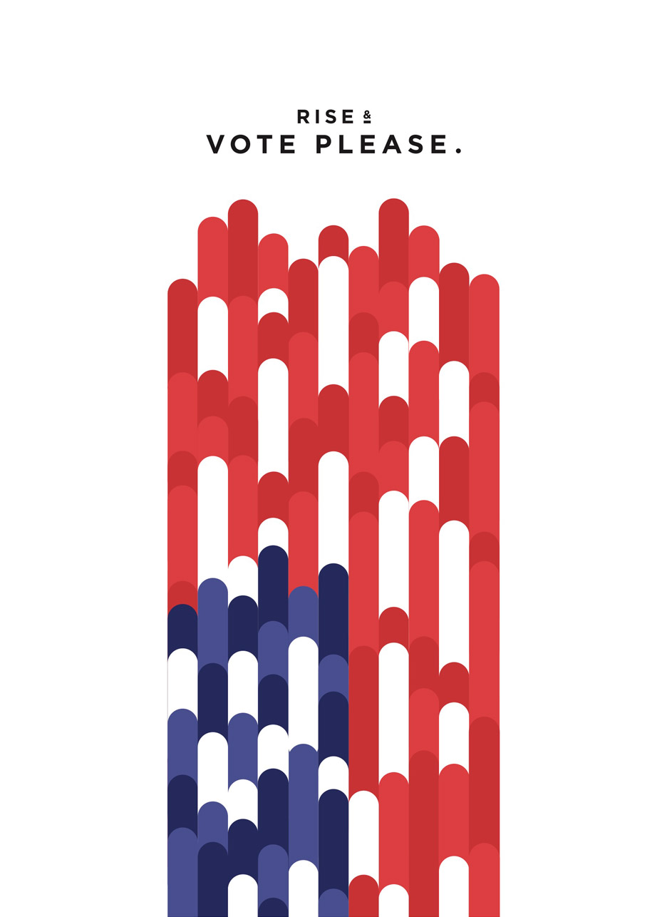
Jesse Wu's Rise & Vote poster

Kevin Garrison's Power and Liberty to All poster
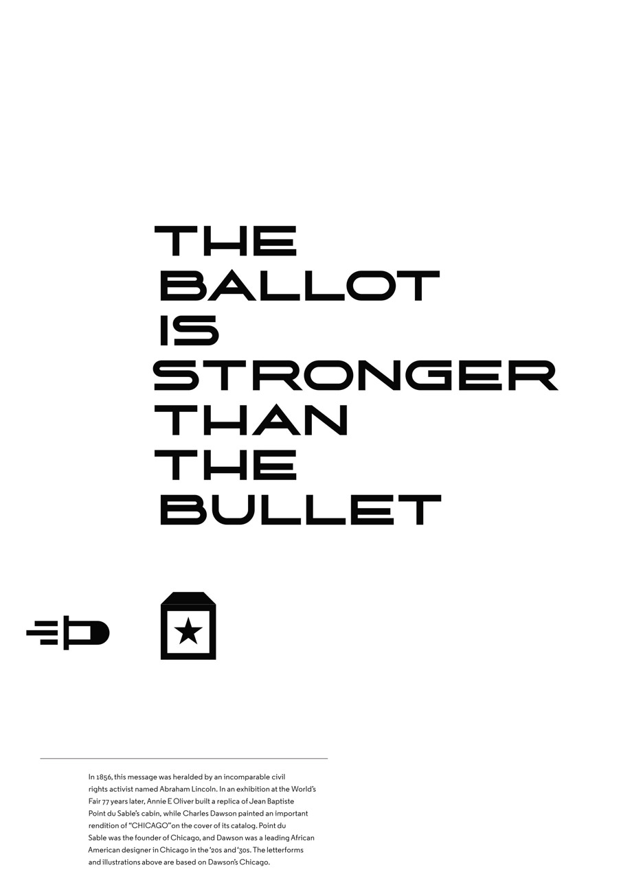
Tanner Woodford's The Ballot is Stronger Than the Bullet poster
Source: http://www.aiga.org/
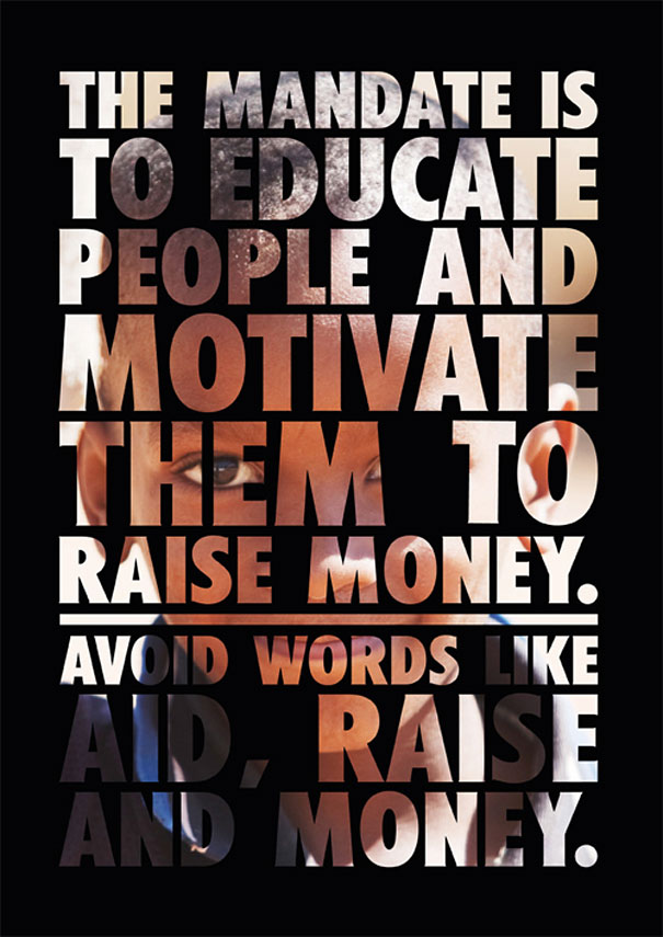
How Good Design Saved the Paper
I don’t know if any of you have ever hear of Polish designer Jacek Utko - I know I never had, but what he managed to do with the power of his design is truly remarkable.
How many times do we hear about how print is dead? It seems to be felt no where more keenly than in the newspaper industry. We are used to having instant news at our fingertips, why would we want a paper copy that seems out of date as soon as it hits the stands? Advertisers seem to feel this way too and in this country alone paper copies of the paper seem to be dropping like flies. Graphic designer, Jacek Utko took on the challenge in his native country and turned around the fortunes of the ailing newspaper industry.
When he initially took on the challenge of redesigning the newspaper he had to field such helpful enquiries as ‘What? Design a newspaper? There’s no design involved in newspapers!” He felt frustrated by this attitude and the shortsighted lack of budget for design. One day he went to see Cirque de Sole and had a revelation, ‘These guys took some creepy, run down entertainment and took it to the highest possible level of performance art, and I thought my god! Maybe I can do the same with these boring newspapers.”
Jacek started to improve all the newspapers one by one, and used the cover space as their signature It became an intimate space of dialogue to talk directly to the readers. Experimenting with type. illustration and photography and having fun soon brought results. In Poland their pages were named cover of the year three ties in a row. The design ethos went beyond just the cover. Each paper was treated as one composition - like a piece of music, with rhythm and as an experience for the reader. The society for newspaper design named the Polish and Estonian newspapers the best newspaper in the world. The rewards then translated directly to the bottom line. After 3 years circulation had increase for the Polish paper by 35%, 100% for the Estonian paper after years of stagnation the redesign excited readers to engage with the medium all over again.
To me this is a great example of how good design increases reach, cut through and eventually your bottom line. People now are more design literate and image savvy than ever. Let me help you to make sure all the collateral you put out in the world is working for you and sending the right messages to your customers.
If you are interested you can view Jacek’s TED Talk and folio here:
http://utko.com/?okay-portfolio=can-good-design-save-newspapers
Proud teacher over here!
http://www.theherald.com.au/story/3883430/winning-takes-the-right-type/


Here I am with my fellow proud teachers Ralph Kenke and Bettina Hodgson, and of course a copy of the book.
Here is a link to the website for the grad show. http://www.uonvis.com/
Love where I live
I am constantly amazed by the beautiful part of the world I live in. Below is a summary of my stroll today, in the middle of not only winter but also the school holidays :)


The value of a good testimonial
Recently I did a job of a friend of a friend who really needed a bit of a head start with a small business she is starting up. I came up with some business cards and some brochures for her and was pretty pleased with the results. She was easy to work with and really trusted my design instincts and when I asked if she wouldn't mind writing me a testimonial for my website this was her response:
Joanne Wier
"With very little input from myself apart from a general outline of my requirements, Miranda designed a business card and two brochures of the finest quality and outstanding design. Her insight and creative finesse has far exceeded any expectations I may have had and I am extremely pleased with the results. I am sure her expertise will propel my business to a higher level of success than I imagined before I engaged her amazing skills."
I can't tell you what a lift this gave me, it's really fantastic to know you have helped someone on their way. Good luck with the business Jo and if there's anyone in Bowral who needs some cakes please give Jo a call.
Lets talk about beauty, Sagmeister at Vivid Ideas and that nasty man Adolph Loos
Last Wednesday I went down to Sydney to see that enigmatic design guru - Stefan Sagmeister - strut his stuff as part of the Vivid ideas festival. Stefan is a rather tall thin Austrian, living and working in New York and busily influencing a swath of designers and design educators. Firstly I will let you know that he didn't disappoint, but those of you who have seen him speak probably knew this already. Sagmeister has an engaging personality and dry delivery that not only gets us thinking but keeps us entertained. I wouldn't want to run the fact checker to heavily over his presentations but it's showmanship at it's best, and does it matter how we get there if we are thinking in the right direction?
The topic of the talk was beauty, or rather it's cruel destruction by the kiddy fiddling Nazis that were the initial founders of Modernism, Adolf Loos getting particular mention. Yep it was as brutal as those Soviet housing blocks we have thankfully begun to see torn down in more recent years. Those modernists have a lot to answer for and Stefan is getting the word out there with a pretty shocking premise - yep the kiddy fiddling Nazi angle.
The very idea that we should look more towards including beauty in our design is a seemingly radical one, why do we need beauty when we can have the international style pervading all our design work? The simple answer is that human beings respond to beauty - who would have thunk it? I personally love this message and I think it gives me a nice segway into a topic I have long bored my friends about which is why is Australia still suffering from cultural cringe when it comes to our design?

Delve into our early design work (post colonisation) and you will be faced with a plethora of all that was unique to our island continent. There was not a single logo that escaped a native animal or floral emblem and yes a lot of unsympathetic representation of our indigenous peoples. I am not saying we need to head back to that kitsch time but why don't we explore what is beautifully unique about here in our design? For anyone whose interested I urge you to take a look at this incredible book:
Symbols of Australia: Behind the Label
If we look to New Zealand we can see a lot of this happening with their design and it's really quite beautiful. There seems to be a real tipping of the hat design wise to Maori culture and their indigenous flora and fauna and it's a beautiful thing.

'Mickey To Tiki Tu Meke' by Dick Frizzell
Let me say thanks again Stefan, I have now seen the HAPPINESS talk and the BEAUTY talk, so I will continue on my merry design path trying not to get too depressed by all the uglines out there.
Why We Need Design Thinking
I came across this great article in Marketing Magazine by Michelle Dunner, and I think it really clearly states how design thinking can improve business. I know this is what we are teaching design students, to think of the user experience and expand on the possibilities of services and products. Here's a great quote by Designworks strategy director Luke van O.
“Even at the exploration stage, design thinking offers an interesting way of approaching problems in a manner that invites trying something new. It’s a positive way of exploring the opportunity for change rather than a scary way of reacting to the need for change."
Read More
https://www.youtube.com/watch?v=RhT_gVh_73w
Newcastle University students take on Taylor Swift
I just wanted to share a fantastic project that my colleague at Newcastle University, Jane Shadbolt, put together for her animation students. Each student had 52 frames of the Taylor Swift song "Shake it Off" to animate, and together they produced 2767 frames of lovingly hand-drawn rotoscoped animation. Needless to say this has been a huge hit on social media and a great boon, (631,35 views and counting) to the University and the students themselves.
"The students really got into the process," said Jane Shadbolt, Lecturer in the School of Design, Communication and IT. "Some of them loved the song, and others hated it – but all of them were able to bring their own unique interpretation to it. It's a great way to get a feel for how animation is put together from thousands of frames and get a feel for how movement happens on screen."
It's really cool check it out!

Creative voice
Lately I have made a discovery, and I have to say it makes me sad. The discovery I have made is that work in my field is not as easy to come by as it was even just a year ago. People are just not spending money like they used to. The rise of internet content and templates means that people are looking to downscale their resources and try to take on a lot of design work for themselves. This leads to some very generic looking content and it’s harder to distinguish any particular voice out there in the market. Not only that, it also leads to poorly produced material.
What will be the long term effect of this handing over of creative output to those who do not make it their life’s expertise? Well I’m a designer so I am going to tell you disaster! Designers role is to think of the end user - always. You know your product, service, content better than anyone but it’s the designer who knows how to reach the people you want to sell to. We make it our mission to understand markets and think of how to get your message out there in the easiest way possible for your audience to digest. This is not just the words on the page but the order they are seen in, how engaging are the colours? When to use a hero image? How to tailor the message to the medium?
Having studied and taught design for well over 15 years I know about these things and I can help you get your brand noticed out in the market.

Example of a proof with corrections hand written and scanned in then sent via email. It is very clear what needs to be changed and what case the letters need to be in.
How to make the review process easy
Being a designer for over 20 years I have experienced all facets of the review process with clients and there are a few tips I can pass on to make this as simple as possible. One way to really make it easy is to put the corrections actually on the file and resend - this can be done via PDF if you have the right software or just put straight onto the item and then scanned in and sent. It's amazing how a simple message in a text of email can be interpreted in many different ways and hence you end up with the review process taking a lot longer than it needs to, which can add up to more costs we want to avoid that right?

Example of corrections sent via edited PDF and some comments back and forth from designer and client. Notice the use of an unusual colour so the correction really stands out.
What do other people think? Please feel free to leave any comments if you have had experience with this. I just want to leave with you with some comments that we designers have all unfortunately had to deal with, they are funny until you are faced with something like this in a brief!

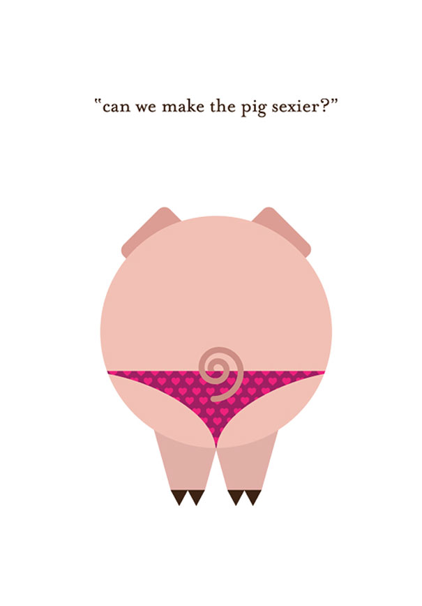
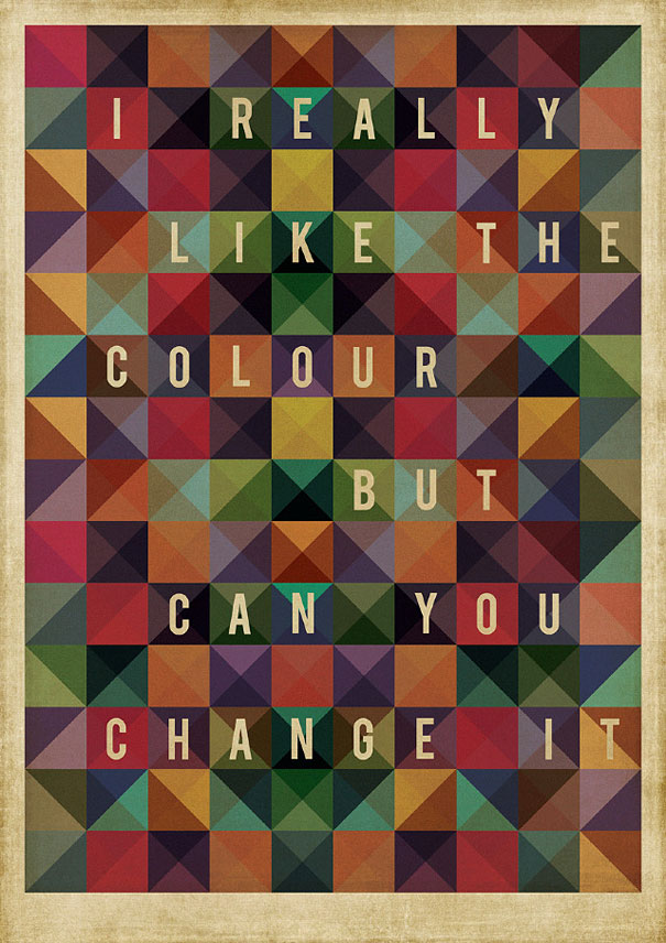
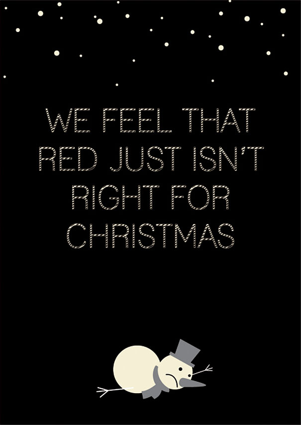
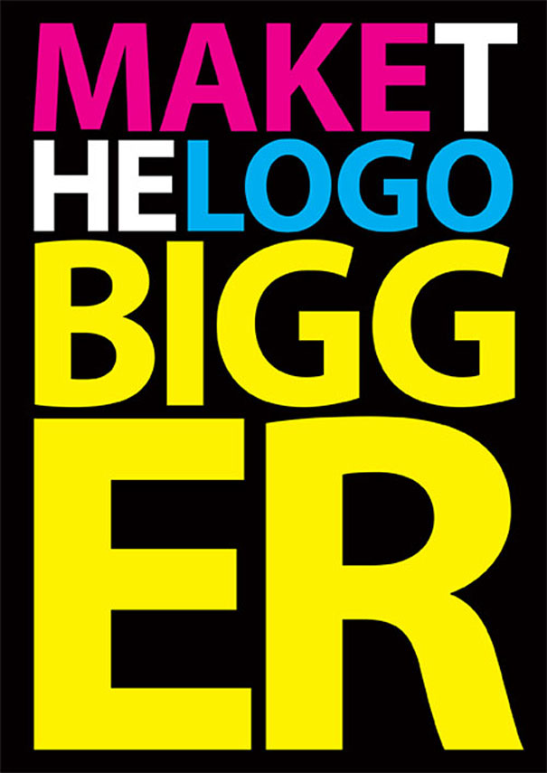

You can click through the above image to see some totes awesome client quotes!
Speculative design work - why it's bad for your business
There seems to be a bit of a worrying trend going on at the moment with clients logging on to creative speculative websites where literally thousands of designers make a bid for your work. What's wrong with that? I hear you say, wont I get loads of options for little or no cost? This is the hook with speculative design work but sadly this is not the reality. Have you ever heard the expression 'If you pay peanuts you get monkeys'? Here are some of the major problems with contracting work in this way:
■ Ignorance
A lot of the 'designers' pitching for work in this way are self taught and have no formal training in design. This can lead to technical issues with file types, colour systems, rendering and printing. There are also more slippery issues such as a lack of knowledge about cultural implications of design, no knowledge of copyright issues or font and image rights and a general lack of responsibility.
■ Economics
A lot of applicants are from developing countries where what seems a little can mean a lot. Hence you leave yourself open to exploiting the vulnerable. There can also be a lot of problems with communication.
■ No respect
Probably the worst offender is having no respect for the design profession itself and preferring to cut corners—never mind the detailed brief, the exhaustive research, the extensive design process and all the other aspects of being a design professional.
For a compelling argument against the creative pitch system from a clients perspective let's take a look at Tom Foulkes, Marketing Director of Peter Brett Associates about how he buys design expertise.
Tom has a compelling argument against the value of speculative creative work. Here's the advice he'd give to other clients.
Selecting and appointing a new design partner is one of the most important elements of what we do.
To be effective, relationships with designers should be built for the long term. We need to be sure that the partnership will work and not just for us as the client but also for the designer/design agency.
We focus on five key areas to help us make this judgment - The Five C's:
- Credentials
- Capability
- Creative
- Chemistry
- Cost
This differs to the traditional methodology for selecting a new design partner, which unfortunately more commonly sees clients ask suppliers to produce creative work as evidence of their ability to undertake the work; the Creative Pitch as it has become known. We believe this method leads to poor decisions and may undermine the commercial strength of our organisation. Fundamentally, we believe the creative pitch is commercially toxic and is a tradition the marketing profession can do without. Commercially toxic may sound a little over the top but here are some of the potential hidden consequences of the creative pitch that can have a negative impact on a business, post decision:
- The creative will be naïve and hastily pulled together. It will be based on a very narrow understanding of you, your market and the true nature of what is required. Creative like this is dangerous to share within a business as it can lead to commercial decisions being made on the basis of taste rather than commercial sense. This ultimately may lead to your own commercial failure
- It isn't free creative, the cost of producing this work will be recovered through the subsequent work you do, the designer/design agency will likely resent giving their work away for free and this dysfunction will undermine and ultimately destroy your commercial partnership. A failure in such a vital strategic relationship may lead to your own commercial failure.
- The quality of any creative produced will only reflect the amount of time the designer has spent on the pitch. In any successful design agency this will not be a great amount of time, unless the agency is struggling to win work. This will lead to poor decision making as it is likely that you appoint a poor agency with lots of time to spend on your pitch over the strongest agency who was busy with fee paying work in the lead up to the pitch. Ultimately this will affect your competitiveness and may lead to your own commercial failure.

Some more things to think about with collaborating with designers
My post below brought up some interesting discussions with my fellow designers and I thought I should start off a bit of a list of factors which can really expedite your work and make the whole process of design much faster. Feel free to add any comments below.
1. Proof your work thoroughly
A common problem with designers and clients is work toing and froing which can really slow down the process of design and lead to an expensive raft of revisions. No one is happy with this situation but a really easy way to cut down on this is to make sure all your copy is fully approved and proof read BEFORE it goes to your designer. This can be really important with longer document where changing copy affects not only how the copy looks on the page but your contents pages, pagination, indexing and how your copy flows around any images. So if possible (and we designers do understand it's not always possible) hand over copy to your designer that's been proofed for spelling mistakes, errors of style and especially any content and your job will be a breeze! That said it's really important that your designer proof reads their work before it goes back to you - proof reading is important for everyone!
2. Be mindful of your images

We designers have a lot of tricks up our sleeves but we need something to work with! A budget for good quality images is not a waste of money and no we can't do much with that image you found on the net. Not every image can be deep etched simply and often the amount of time spent trying to 'clean up' bad photos ends up in a very expensive average image.

Corporate Identity and Business Cards designed by Miranda Douglas
A few things to think about for your Corporate Identity in the new year ....
1. Know How About Your Business
It's really important to brief your designer thoroughly on your business and where you see it in the market place. No one knows your business better than you and no one knows how to design for your business better than your designer so a great open communication and respect for each other's skill sets will really make the process easier.
2. Perception of Others
Be aware that how you see your business, products and services may differ from how it's perceived in the marketplace. This is where design can really lift your profile and turn around any negative impressions that may have been made in the past.
3. Look for Similar Organizations
Have a look at what your competitors are doing and how they market themselves. Share your thoughts with your designer so they get a good idea of what your aesthetic is, BUT please be prepared to listen to their advice as well - after all design is their field of expertise.
4. Highlight Future Ideas
Think about where your business will be in 5 - 10 years. You want your image to be suitable for your company as it grows and expands and to have a strong visual identity that can build a presence in the marketplace. You don't have to totally abandon the past but sometimes a radical change can be just what the doctor ordered.
5. Show creativity
Remember the old days when every bank used blue and serif fonts in it's logos? Those days are over! People are exposed to so much more visually than every before and have developed quite discerning and critical eyes as far as design is concerned. Clip art is a definite no no people!
Leigh Bowery
I'm not sure how many of you know about the legend that is Leigh Bowery but he went a long way from Sunshine Victoria in his interesting but sadly short life. Check out this doco if you're interested https://www.youtube.com/watch?v=Z_S_FOfOhN0

Leigh Bowery
Kooky
Hey folks - another interesting design moment 'uncomfortable objects'. I love the way these products make me squirm.
http://9gag.com/gag/aj66Rx1
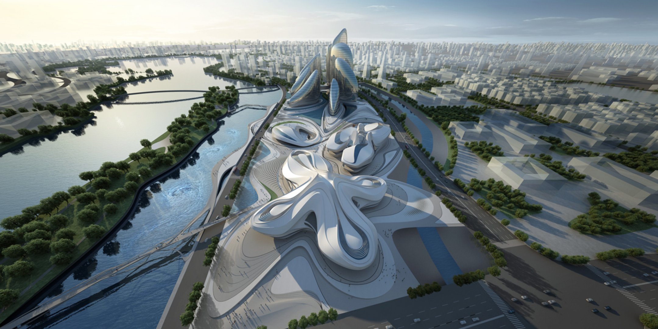
Amazing architect
http://www.zaha-hadid.com/
Hi all I just wanted to put up a post about this incredible architect I just discovered. Her stuff is neo futuristic and really interesting. There is an architecture module to the new course I am teaching and it's great to be making all these discoveries.

Zaha Hadid –
Beko Building Belgrade

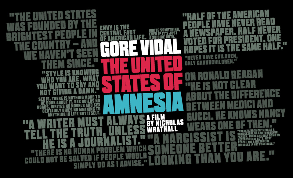
Gore Vidal - United States of Amnesia
There is a great review of my friend Nicholas Wrathall's film in the Herald today by Elizabeth Farrelly. You can also watch the film on ABC iView for the next two weeks. It's a fantastic doco so check it out.
SYDNEY MORNING HERALD COLUMNIST, WRITING ABOUT GORE VIDAL: THE UNITED STATES OF AMNESIA IN TODAY'S PAPER
http://www.smh.com.au/comment/why-we-need-writers-20140730-zyfin.html