I don’t know if any of you have ever hear of Polish designer Jacek Utko - I know I never had, but what he managed to do with the power of his design is truly remarkable.
How many times do we hear about how print is dead? It seems to be felt no where more keenly than in the newspaper industry. We are used to having instant news at our fingertips, why would we want a paper copy that seems out of date as soon as it hits the stands? Advertisers seem to feel this way too and in this country alone paper copies of the paper seem to be dropping like flies. Graphic designer, Jacek Utko took on the challenge in his native country and turned around the fortunes of the ailing newspaper industry.
When he initially took on the challenge of redesigning the newspaper he had to field such helpful enquiries as ‘What? Design a newspaper? There’s no design involved in newspapers!” He felt frustrated by this attitude and the shortsighted lack of budget for design. One day he went to see Cirque de Sole and had a revelation, ‘These guys took some creepy, run down entertainment and took it to the highest possible level of performance art, and I thought my god! Maybe I can do the same with these boring newspapers.”
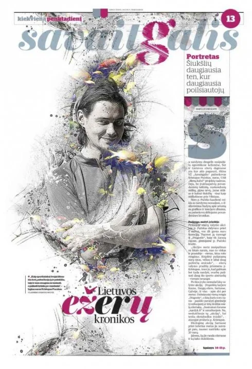
Jacek started to improve all the newspapers one by one, and used the cover space as their signature It became an intimate space of dialogue to talk directly to the readers. Experimenting with type. illustration and photography and having fun soon brought results. In Poland their pages were named cover of the year three ties in a row. The design ethos went beyond just the cover. Each paper was treated as one composition - like a piece of music, with rhythm and as an experience for the reader. The society for newspaper design named the Polish and Estonian newspapers the best newspaper in the world. The rewards then translated directly to the bottom line. After 3 years circulation had increase for the Polish paper by 35%, 100% for the Estonian paper after years of stagnation the redesign excited readers to engage with the medium all over again.
To me this is a great example of how good design increases reach, cut through and eventually your bottom line. People now are more design literate and image savvy than ever. Let me help you to make sure all the collateral you put out in the world is working for you and sending the right messages to your customers.
If you are interested you can view Jacek’s TED Talk and folio here:
http://utko.com/?okay-portfolio=can-good-design-save-newspapers

